WordPress and Cloud Storage Apps – How Safe is Your Data?

Up, Up, and Away!

We somehow have this picture in our minds that all the stuff we upload online is somehow floating over our heads, whisked way, way up into cyberspace. But what do we know about Cloud Storage and what really happens to all the files we upload? Maybe some people can probably relate to this old song about clouds by Joni Mitchell.

I’ve looked at clouds from both sides now
From up and down and still somehow
It’s cloud’s illusions I recall
I really don’t know clouds at all

Is Cloud Storage all that it promises to be? Convenience, accessibility, tons of file space. Is it possible that this nice, fluffy, feel good Cloud could go wrong and cause seemingly irreparable damage to its users? Case in point, the recent celebrity photo hacks, Dropbox, iCloud, Snapchat, etc. Is Cloud Storage really safe to use?

Of Dropbox, Copy, Box, and other Cloud Storage Apps

Cloud storage service is an amazing innovation, which allows you to upload, store and share images, videos, and other type of content online. How does it work?

Cloud storage is a model of data storage where the digital data is stored in logical pools, the physical storage spans multiple servers (and often locations), and the physical environment is typically owned and managed by a hosting company. These cloud storage providers are responsible for keeping the data available and accessible, and the physical environment protected and running. People and organizations buy or lease storage capacity from the providers to store end user, organization, or application data.

Cloud storage services may be accessed through a co-located cloud compute service, a web service application programming interface (API) or by applications that utilize the API, such as cloud desktop storage, a cloud storage gateway or Web-based content management systems. (source: Wikipedia)

Ok. That’s a mouthful. In other words, Cloud Storage “refers to saving data to an off-site storage system maintained by a third party. Instead of storing information to your computer’s hard drive or other local storage device, you save it to a remote database. The Internet provides the connection between your computer and the database.”

Hacker Proof Cloud Storage

Does it exist? Probably not. Just like secrets, keeping digital information from getting into mischievous hands is like pinky swearing. There is no fool-proof way. Ever tried to format, erase or delete photos from your memory card or your hard drive? Guess what. They still live there, way below the recesses of your storage device and can still be extracted using recovery software. Yup, even after you’ve formatted or reformatted (quick reformat and not full format) And that’s just local storage. Still very much within the scope of your control. But what about cyber storage? Does this mean that you shouldn’t use Cloud Storage at all?

Secure Your Online Data

People are paranoid about large-scale theft of personal information. Unknowingly, they post more than just the usual profile information required when joining a social or public website. (Check out this amazing mind reader.) Their entire lives are posted blow by blow on social media – voluntarily. But the operative word here is – voluntarily. Quite the opposite of theft, where someone takes away from someone against his or her will or permission.

There will always be risks. Whether online or offline. Once anything is uploaded and publicly shared, the risks should have been supposedly counted already. It can be stolen, shared without permission, downloaded, altered, wrongfully claimed, disputed, etc. It’s a reality. Of course, the expectations change when information is shared with restrictions.

People need to be fully aware of what they are sharing, to whom they are sharing it with, and where (websites, online storage, etc.) they share, post, or upload. Make sure to read and understand (someone said this is the biggest lie online) the terms of use of websites and note if there are any third party clauses that allow these websites to share, sell, or pool personal information to their suppliers or sponsors.

Use a strong password and don’t repeat the same password in different places. Consider a password manager. Use the two-step verification or two factor verification option if a website provides one. Do manual backup instead of automated backups. It doesn’t hurt to create your own self-policing practices to ensure that your rights to privacy or ownership rights are not violated.


Happy Birthday WordPress!

WordPress celebrates its 11th year this May and it can only get better. It may be a bit more quiet than last year’s 10th year celebration but things have been equally if not more exciting than ever. Here are some interesting statistics you need to know about WordPress (.com and .org).

  • 11 Years
    It’s been 11 years since WordPress was first released – May 27, 2003 to be exact.
  • 22% Usage, 60% Market Share
    According to W3Techs.com, WordPress is used by 22.3% of ALL the websites, which translates to a content management system market share of 60.0%.
  • WordPress 3.9 – Downloaded 19.3 million times
    WordPress 3.9 which was released fairly recently has already been downloaded more than 19.3 million times (as of this writing).
  • 2,531 themes, 101,742,042 downloads
    – in the WordPress Theme repository alone with approximately more than 10,000 themes available in the marketplace.
  • More fun embed stats from partners and friends that their users have embedded WordPress short codes on their sites:
    Twitter – 32,978,750 (as of May 2014)
    YouTube – 12,933,230 (as of Apr 2014)
    Flickr – 14,952,725 (as of Apr 2014)
    Vimeo – 29,158 (as of May 2014)
  • WordPress localized in 140+ ways. Find your language here.

Happy Birthday, WordPress!


Web and WordPress News Roundup for April 2014

Hello spring, farewell winter. Time to get out of the house, grab a comfy chair, watch the snow melt and catch up on the most interesting news on the web today. Here are some of the most interesting posts and articles buzzing right now in the big www.


Web Design Trends WordPress Users Need To Know

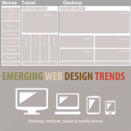
WordPress is the most popular content management system existing today fetching 21.8% of the world’s total internet usage and capturing 60.3% of the market share as per W3tech’s latest market report. It comes as no surprise that the majority of the general web design trends predicted for 2014 are already common features available and/or integrated in most if not all WordPress themes being sold in the marketplace today. It makes you wonder whether WordPress is only a trend follower or it is actually THE trend setter to watch.

WordPress core developers, theme and plugin developers and authors, and the WordPress community in general are some of the most passionate people on the planet. With only ten years tucked into its belt, WordPress has emerged as one the most dynamic and cutting edge platforms today primarily because of the commitment of its community.

In a recent business article on eCommerce design trends for 2014, it lists trends that WordPress users already consider as familiar features. The trend list includes:

  • flat design
  • responsive design
  • less sliders
  • more user friendly navigation
  • more creative use of web fonts

These trends have actually appeared in most WordPress themes as common features in the last year or so. Even Forbes magazine, lists similar web design trends in an article that came out early this year. Although Forbes also adds “storytelling design” characterized by concise, compelling copy coupled with strong imagery as one of the significant web trends that will emerge in 2014. Guess what? A wonderful new WordPress plugin – Aesop Story Engine – in relation to the “storytelling” trend has already been generating a lot of interest lately.

For those who have been following the development path of the latest WordPress version that is to be released (April 16), there are several new features in WordPress 3.9 that could set off new “trends” in the web design world. WordPress 3.9 emphasizes more user friendly features and improved multimedia handling capabilities. A few of these significant features that are worth noting are listed below:

  • New features like live widget previews
  • a new theme installer
  • UI refinements when editing images and when working with media in the editor including the return of some of the advanced display settings for images.
  • audio and video playlists
  • new gallery support
  • The formatting function that turns straight quotes into smart quotes (among other things) underwent some changes to drastically speed it up.

More detailed features can be viewed on the WordPress core development website.

Having said all that, it is interesting to note that the thrust towards being more multimedia savvy while at the same time being more and more user friendly could be a significant WordPress feature that could set off a general web design trend. With WordPress gaining more and more influence over the whole internet population, it is possible that whatever developers, coders, designers, authors, etc. come up with to improve WordPress products and services could eventually be the standard that the web design community will use.

Who knows what WordPress will be like in the next 10 years. The innovations succeeding WordPress iterations will bring and the vast influence it will have in relation to the entire Internet population, mobile, tablet or what not together with the hardcore commitment of its core community will definitely create an impact on the way the world wide web looks and functions. Whatever it is, anything that goes on in WordPress is definitely going to be exciting and worth watching.


Must Have Features in Choosing a WordPress Theme for your Website

WordPress theme trends come and go. Some popular features a while back have faded away while others went mainstream and have become basic and essential features integral to a WordPress theme. A lot of the WordPress themes in the marketplace today are feature-packed and sometimes it gets overwhelming to choose the perfect one. Website owners need to be able to sort through long menu of features, pull out those that are relevant to their own specific website needs and goals, just to make sure they don’t get an over bloated and slow-loading website. Here are some basic features to look for in selecting a WordPress theme to fit your website needs.

Flexibility and Ease of Use

User experience is a key factor in web design. WordPress themes must be flexible enough to adapt to the user’s needs and provide way for customization to be simple and easy. A popular feature nowadays is the drag and drop feature where layouts can be configured and reconfigured by simply dragging and dropping elements into specific areas. WordPress themes that include this feature already have a fan base as it makes customization convenient and friendly even for WordPress beginners.

Responsive (On or Off feature)

The emergence of mobile platforms in internet usage makes its users a population that shouldn’t be ignored. A lot of people think that mobile might eventually displace desktop as the dominant platform for internet access. In light of this, website owners need to consider WordPress themes that are 100% responsive enabling content to be presented efficiently on smartphones, tablets, and other mobile or handheld devices. Themes that include features such as menus especially designed for mobile devices, responsive sliders, and responsive images are also a plus factor. Some also prefer that they have control over whether they want the responsive feature turned on or off which means that WordPress themes that have this option will appeal to this type of web user.

Search Engine Optimization

It would be a pity for a site with amazing content to be left to obscurity because search engines can’t find it. According to Joost de Valk, creator of the popular SEO plugin Yoast,

“Out of the box, WordPress is a pretty well optimized system, and does a far better job at allowing every single page to be indexed than every other CMS I have used. But there are a few things you should do to make it a lot easier still to work with.”

WordPress themes that are built according to best code practices and are integrated with sound SEO measures will do well as far as search engine visibility and ranking are concerned.

Multi Media Handling Capabilities

Gone are the days where people are merely content reading stuff on the web. Today’s generation of internet users seek more interactive and media heavy content. Website users tend to lean towards WordPress themes that are flexible enough to handle all types of media formats (audio, video, images, etc). Support for self-hosted videos, Youtube, Vimeo and SoundCloud, and other third party multi media content hosts is always a plus as internet users today.

Animations, Parallax, Sliders, etc.

Some people detest sliders and other visual eye candy. Some don’t even think that it helps a site at all while some consider these visual effects necessary features in a website. When people get to your site, you want to ensure that they get enough interest to go through your content. The use of all these visual effects can go from cheesy to spectacular depending on how it is presented. Today’s media bombarded user can benefit from well-thought of and creative visual presentations that feed both the eyes and the mind.

Translation or Multi Lingual Ready

WordPress already powers more than 21% of the Internet and will continue to increase even as of this writing. This means that more non-English speaking users will be thrown in the mix of users and will need themes that can be translated into their own languages and with RTL (right to left provision). This segment of WordPress users will be more attracted to themes that are easier to adapt to their local audiences.

These features listed here may or may not be on the top of your list. If you do have some suggestions, feel free to leave us a comment and tell us why you think so. We’d love to hear from you.


Around the Web: WordPress and Tech News


WordPress Websites to Inspire You

WordPress has been around for 10 years and continues to go strong as more and more people discover the many creative ways you can use it for to create the website you need and want. One of the best ways to demonstrate the many possibilities you can achieve with this free software is to see an actual WordPress website that is both beautiful and functional. Be inspired with these outstanding WordPress websites we’ve found:

WordPress is a pretty powerful tool you can use to create amazing and stunning websites with. Its tried and tested coding architecture makes it one of the most robust content management platforms out there today. The best part of it all is that it is available for free.

We hope these websites inspire you to imagine and create that dream website you’ve always wanted.


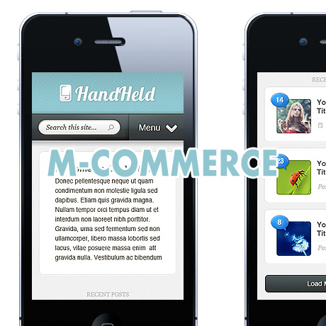
M-Commerce – The Mobile Market, Web Design and Conversion

The unstoppable invasion of mobile computing and how it has woven itself into our daily routines is undeniable. A life without the Internet, free WiFi, and our handheld devices is almost unimaginable and web designers have heard and heeded this lifestyle change, hence, the birth of responsive, fluid, and liquid design trends. Mashable has even named 2013 “The Year of Responsive Design”. However, we are still in the early stages of understanding this mobile demographic to yet see tangible and consistent conversion results from the marriage of Mobile Commerce (M-Commerce) and Web Design for handheld and mobile devices. Responsive design does not necessarily equate to actual conversion, whether in sales, subscriptions, or networking.

According to a report by Litmus.com,

“More email is read Mobile than on a desktop email client or via webmail. Stats say 36% of email is now opened on a mobile device, with 33% for desktop and 31% for webmail.” – Litmus –”Has your audience gone Mobile” (June 2012)

As of September 2012:

We’ve seen some major changes in mobile email opens in the past year and a half. As of September 2012, 38% of all opens were on a mobile device, compared to only 17% eighteen months ago—that’s a 123% increase in mobile opens!

Diving deeper into specific mobile operating systems, the majority of these opens are being made on iOS (iPhone and iPad – 80.34%) and Android (18. 93%) devices:

The next question is, Does Mobile Traffic Convert into Leads?

Not necessarily so. There are several factors that lead to actual traffic conversion and there is no hard and fast rule on it but website owners can make educated guesses based on actual data and stat results gathered from their own website traffic trends.

Three ways to reach your target mobile traffic:

Run a native mobile app

  • Needs to be downloaded by the user
  • Restricted amount of content and functionality

A mobile website or M-Dot (a dedicated scaled down mobile version of the main website)

  • Advantage – faster loading time and optimization
  • Disadvantage – two bodies of content to manage

Responsive web design

  • Uses responsive, fluid, liquid layouts, media queries, and flexible images to adapt to various devices and resolutions
  • More future friendly
  • One body of content to manage
  • Consistent brand experience
  • Social media friendly

Among all three, responsive web design appears to be the most feasible way of reaching your target market. But is responsive web design enough to address the problem of conversion?

Here are some strategies to consider to maximize your web design and marketing optimization efforts to improve your conversion rates on your website:

Create a mobile optimized landing page

  • Make sure that your landing page is displayed properly on all screen sizes (portrait and landscape)
  • The need for speed – achieve fast loading time (5 seconds or less) by using optimized media content (images, video, and audio) and scripts.
  • User friendly – Prospects don’t have to type anything just click a button. If possible, must be clickable by the thumb.
  • Content must be simple, readable and easily navigable. Call to action buttons must be prominently but strategically located.

Create a mobile optimized order form

  • Redirect users from the landing page to your mobile optimized order form.
  • Form fields should be easy to read and fill out on any mobile device. Longer forms lead to boredom and lower conversion rates.
  • Remove all sidebar content so the form fits perfectly on the viewable window of the mobile device

Create several versions of your landing pages and order forms and test which ones convert the most. Improving User Experience and establishing a User Friendly Interface all contribute to an enjoyable browsing experience for your mobile visitors which will eventually boost your conversion results.


Web Design Tools for WordPress 2013

Learning is a never-ending journey. There’s always room to grow, things to improve, and ways to make things better, more efficient, and more effective. Here are some (premium and free) web design tools that can help WordPress authors and developers reduce work time, increase productivity and improve work quality:

Sail.js (Free)

Sails.js makes it easy to build custom, enterprise-grade Node.js apps. It is designed to resemble the MVC architecture from frameworks like Ruby on Rails, but with support for the more modern, data-oriented style of web app development. It’s especially good for building real time features like chat, it automatically builds a RESTful JSON API, and it supports HTTP and WebSockets. The Sails framework was developed by Mike McNeil with the support of Balderdash.

Backbone.js (Free)

Backbone.js gives structure to web applications by providing models with key-value binding and custom events, collections with a rich API of enumerable functions,views with declarative event handling, and connects it all to your existing API over a RESTful JSON interface.

Extra Strength Responsive Grids (Free)

Extra Strength Responsive Grids are percentage-based, for smooth, non-snappy width adjustments that enable you to take total control of your layout. ESRG deploys meaningful class names such as grid-half and grid-quarter to make life easier. ESRG is also SASS-enabled.

Easel Design without a Designer (From Free – $99 Subscription)

Easel is an in-browser, high-fidelity web design tool that lets you mockup, share and implement your ideas with ease. This WYSIWYG web design tool aims to make web design and development easier for teams who want to quickly get their ideas online without having to hire a designer. The app is a great resource for people who don’t have any coding experience but know what they want visually.

Responsive Nav (Free)

Responsive Nav is a tiny JavaScript plugin which weighs only 1.7 KB minified and Gzip’ed, and helps you to create a toggled navigation for small screens. It uses touch events and CSS3 transitions for the best possible performance. It also contains a “clever” workaround that makes it possible to transition from height: 0 to height: auto, which isn’t normally possible with CSS3 transitions.